This logo is from a charity organisation called The Teutonic Order of St Mary’s Hospital in Jerusalem. I liked this logo as it gives the look and feeling of being embraced and as the the each hand is a different colour it could symbolize diversity.
This logo is from the Giving Gardens charity. It is a simple logo but I liked because of the hand growing from the plant. It gives the feeling of growth through human involvement.
This image is for a charity which stands for unity. It symbolizes people from all different cultures and races coming together. It also features a ribbon with all the colours used for representing the people.
This logo is designed by C Sharp Design in the UK. This particular design is for another charity. Although the charity is not specified in the logo we can see forms of people made from the charitable ribbons.
This logo is one of my random ones. Nothing to do with charity or to do with the project. I chose this because of its simplicity and the use of the letter Y to help make up the character.
Again a random logo I found when I was looking for a website to buy a new bike. I thought this was a good logo design. Just like the one above this logo uses the the word cycle to make a picture of a bicycle.
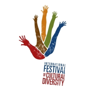
One of the symbols and pieces of art I found that was used for the International Festival of Cultural Diversity. I liked the idea that the mix of colours blend in to form one colour with the picture of hands.
Another picture for the International Festival of Cultural Diversity. I liked the way that all the hands originate from the same area as if to suggest we all come from the same place. Also the different colours to represent the different cultures.
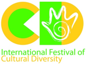
Again another picture for International Festival of Cultural Diversity. This one however is a little more simple but with the bright colours it is very catching to the eye. I also liked the hand drawing on the D.
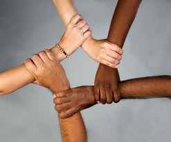
Ok so its not a symbol. But I really liked the idea of the hands from different races supporting each other and also the way the hands are holding on to each other they form a star shape in the middle. Although its not a symbol, this image could help give some ideas for creating a Cultural Diversity Logo.
I really liked this logo. It is simple but stylish, colourful and eye catching. I liked the way the artist used a simple wavey line to form the initials VW.
Again another random image I just stumbled across but I really liked the look of this. The lizard picture is the same in all for small frames with a different colour background. Again it gives good ideas of how to use simplicity to generate a logo design
